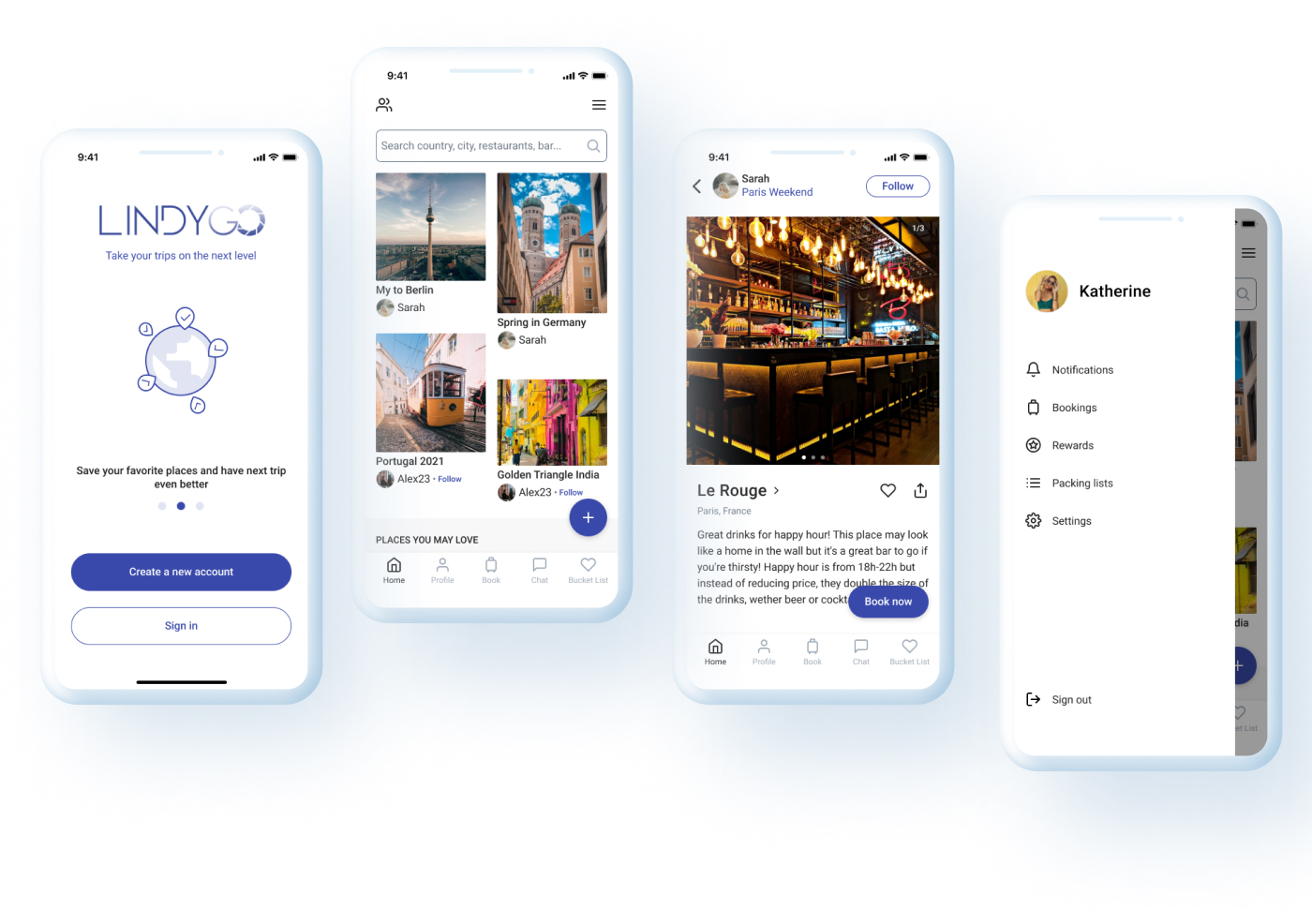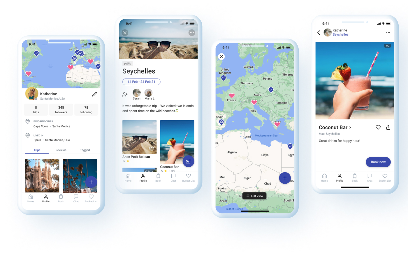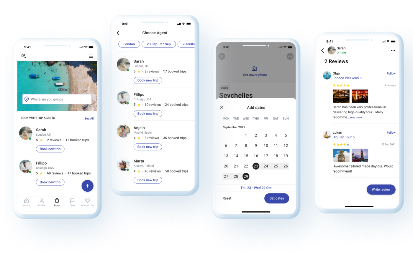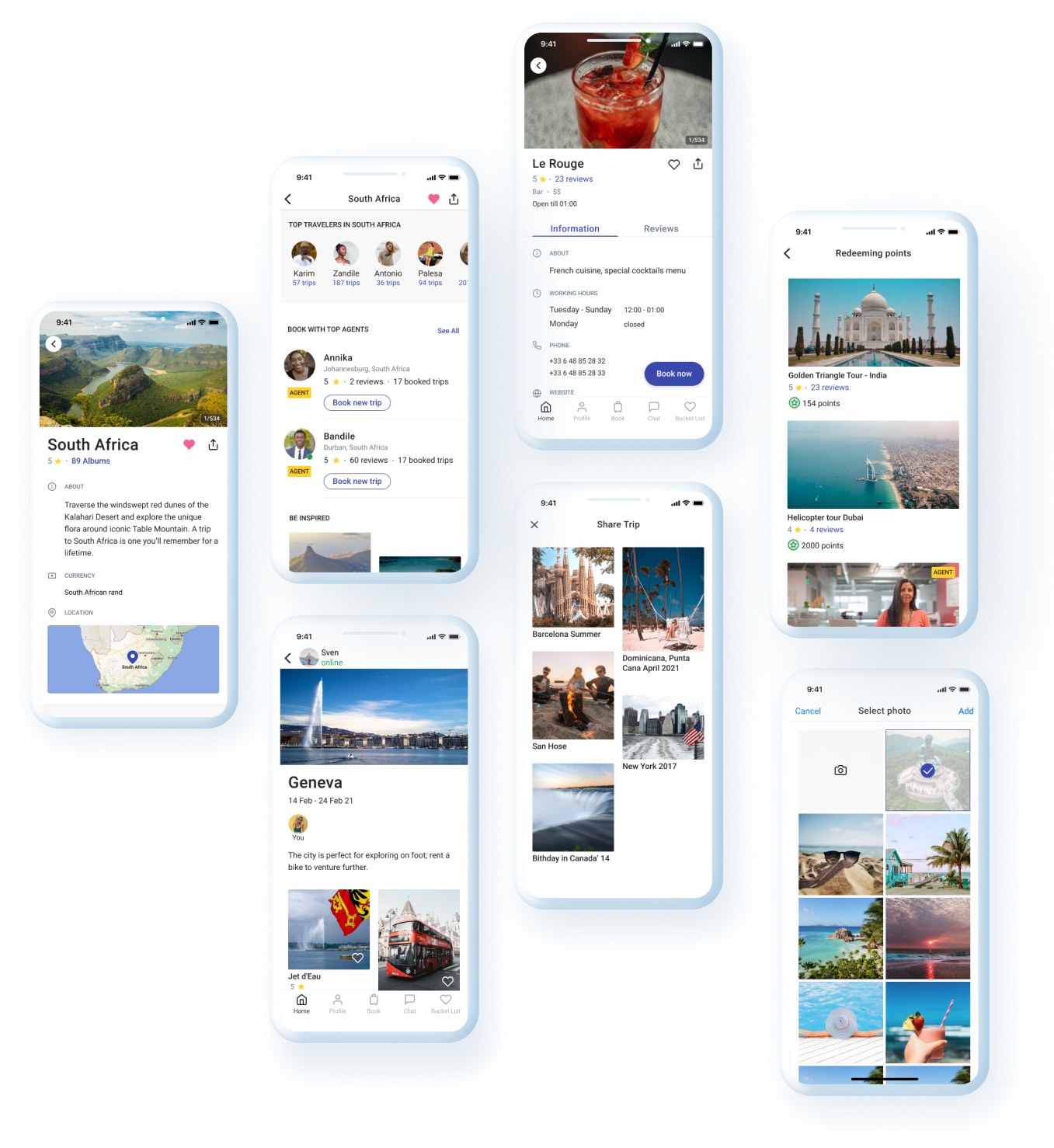
Travel Social App that allows users easily plan trips, quickly create bucket lists, get recommendations from agents and share their holiday memories.
Convert raw business ideas into an emotional digital experience, by creating a user-friendly travel social app where people upload pictures of their vacation, tag location and can get recommendations by looking through their friend’s albums and a bunch of other useful features for the best trips.
Starting from scratch, I’ve applied UX methods and UI principles, to deliver high fidelity design in the minimalistic style.
For this project, the following was done:


I have followed human-centered design process that consists of five core stages:

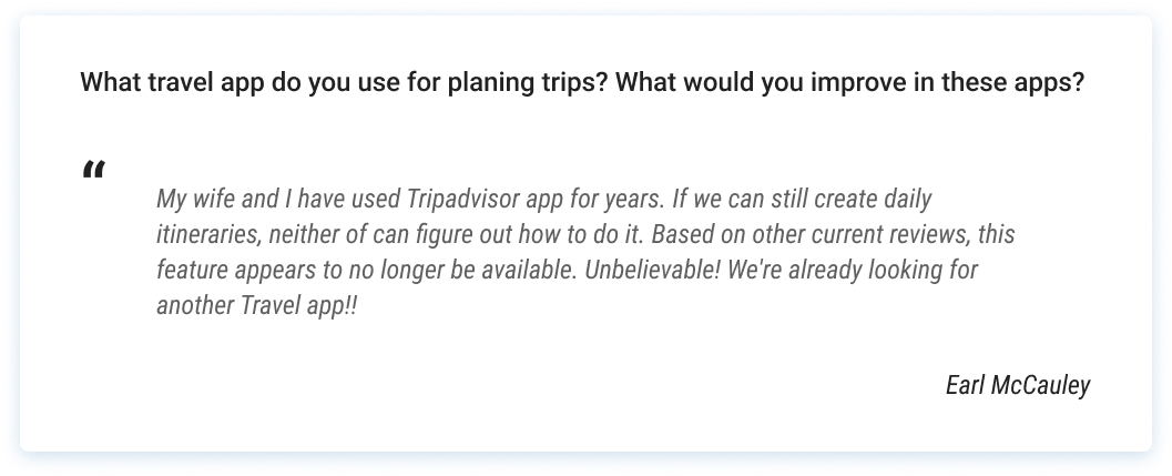
To develop the best possible understanding of our users, their needs and their problems I have interviewed 5 people and conducted a survey, and analysed reviews from competitors' platforms and apps.
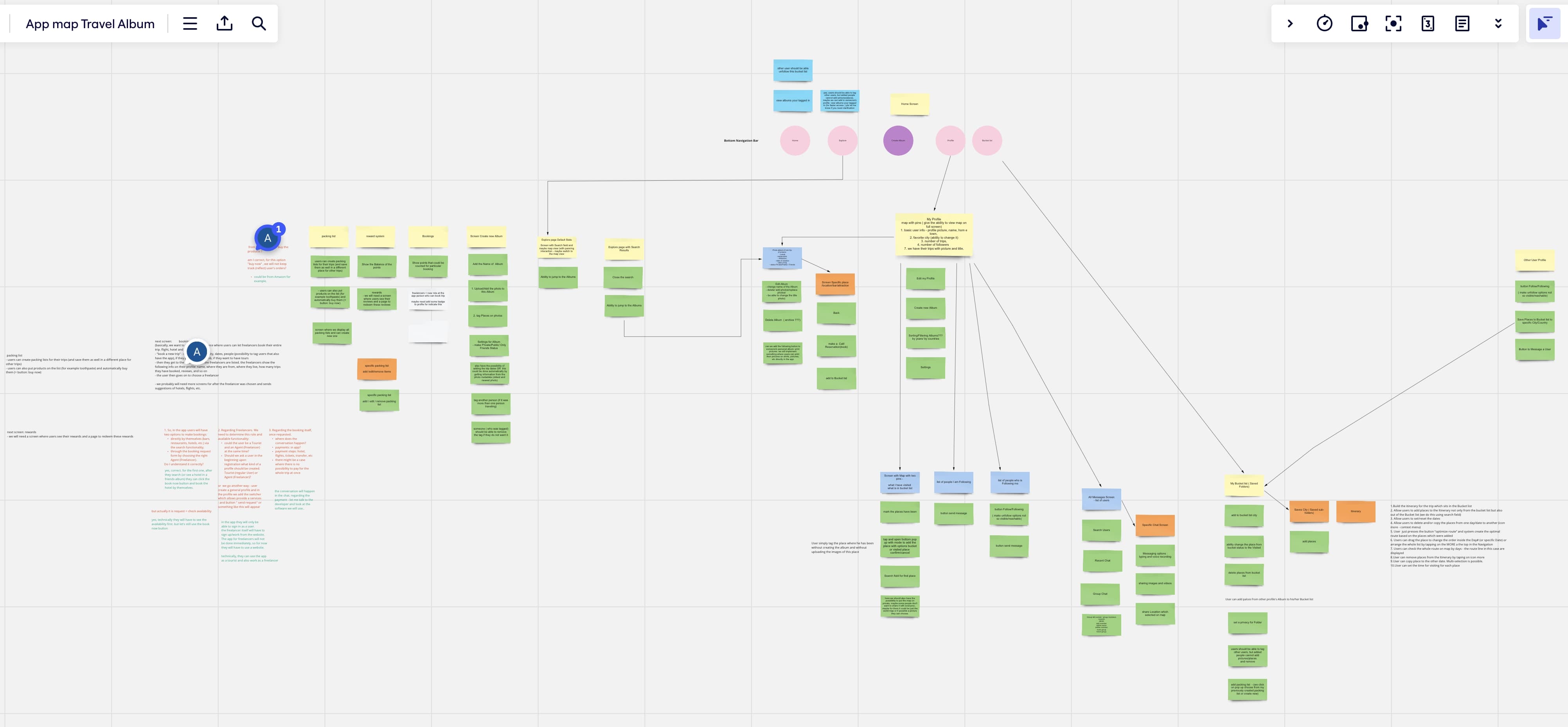
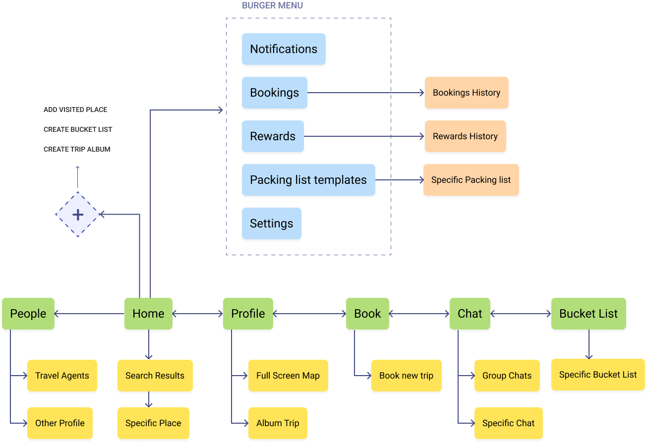
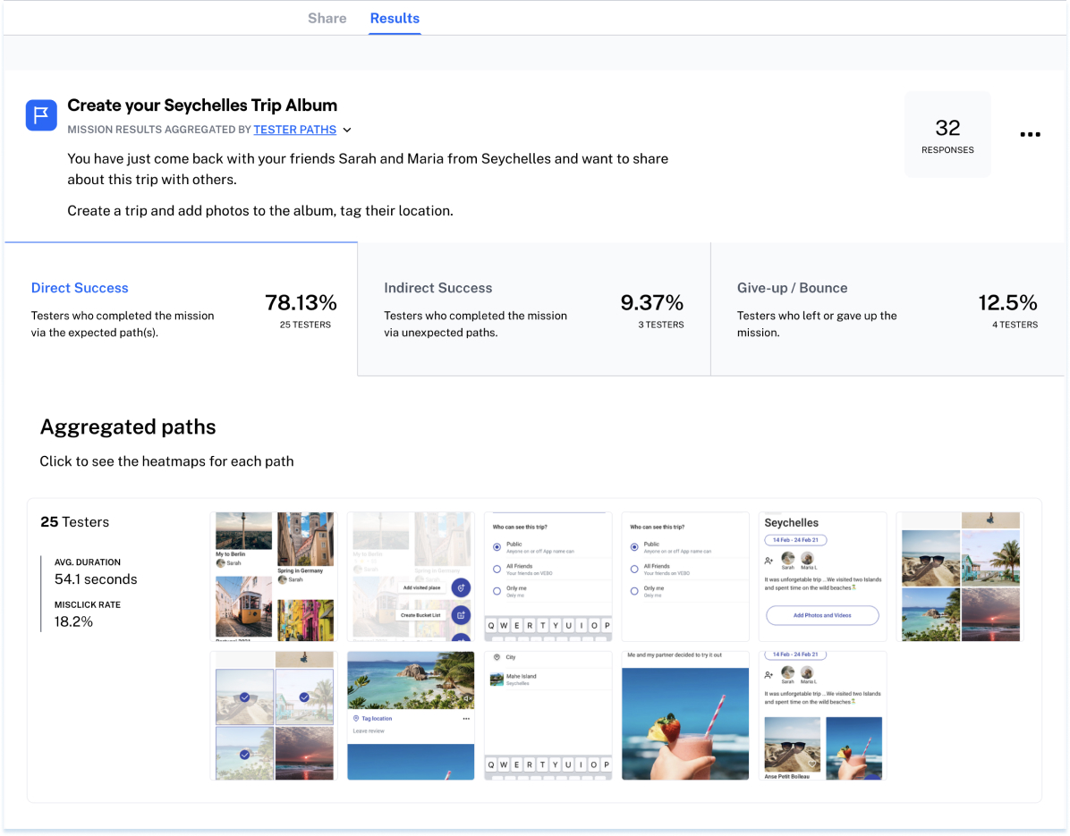
The benefit of remote testing is participants interact with design in their natural environment — at home, in their office, or in a specific location. For remote usability testing I've created a clickable prototype and different tasks with scenarios. The purpose of this usability testing was to measure how easy and clear the flow is and find out the average time to complete the task.
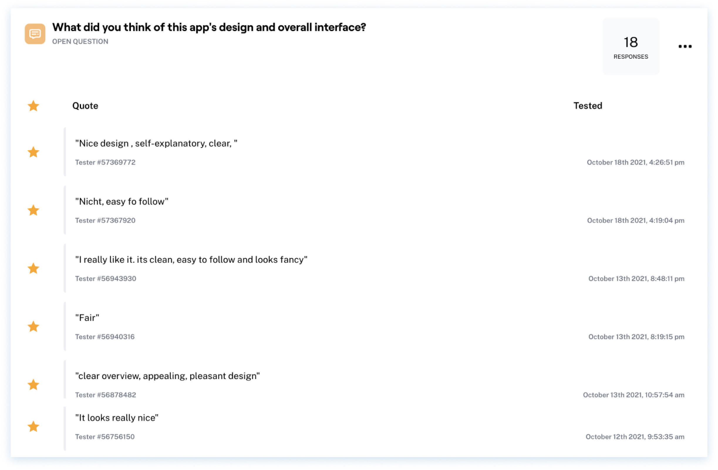
Additionally to usability testing, it is very useful to get participants opinion about the satisfaction of the interface and flow. Below the results from the surveys after test completion.
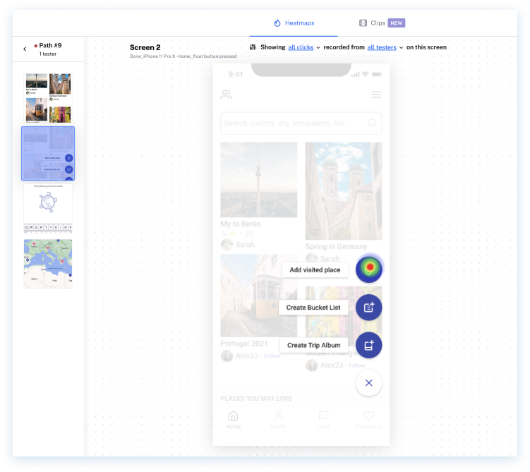
Several unsuccessful test paths uncovered that users tapped “Add visited place” instead of “Create Album”. This is what we fixed, and removed this option from the list of actions when pressing the floating button on the Home screen.
It means that we always need to check the designer’s model with the user’s mental model by conducting usability testing before starting the development process for saving money and most importantly to provide a product that people will love to use.
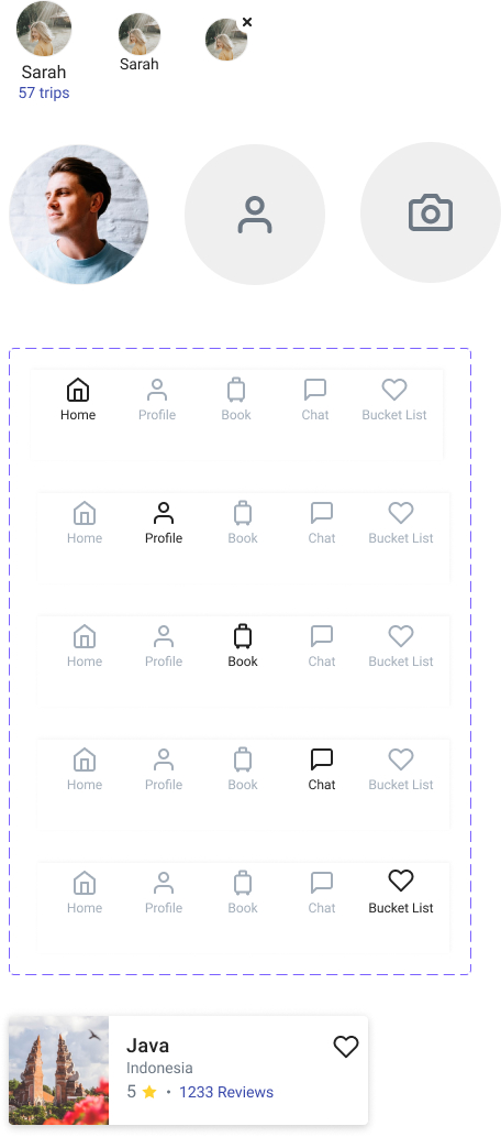
The deliverables were over 200 screens and a Design system using reusable components, variants and smart layout technics, with followed mobile guidelines
