SPHAIR offers pre-aviation training courses. It inspires young Swiss people to become airline or military pilots and parachute reconnaissance officers.
The main challenge was an outdated website and hassle navigation and information architecture in
general. The client has noted how low the number of mobile visitors/traffic is. The main target
audience of the website is 17 to 22-year-old Swiss men and women who mostly browse on mobile.
The previous navigation and information architecture made it challenging for users to find
information easily on the website. Another critical issue was the content presentation - there was a
lot of long text-to-read instead of engaging media content such as shorts, videos, bright images,
which aligned better with the preferences of the young audience. Additionally, there was a need to
enhance the overall look and feel and implement consistent visual identity across all touchpoints.
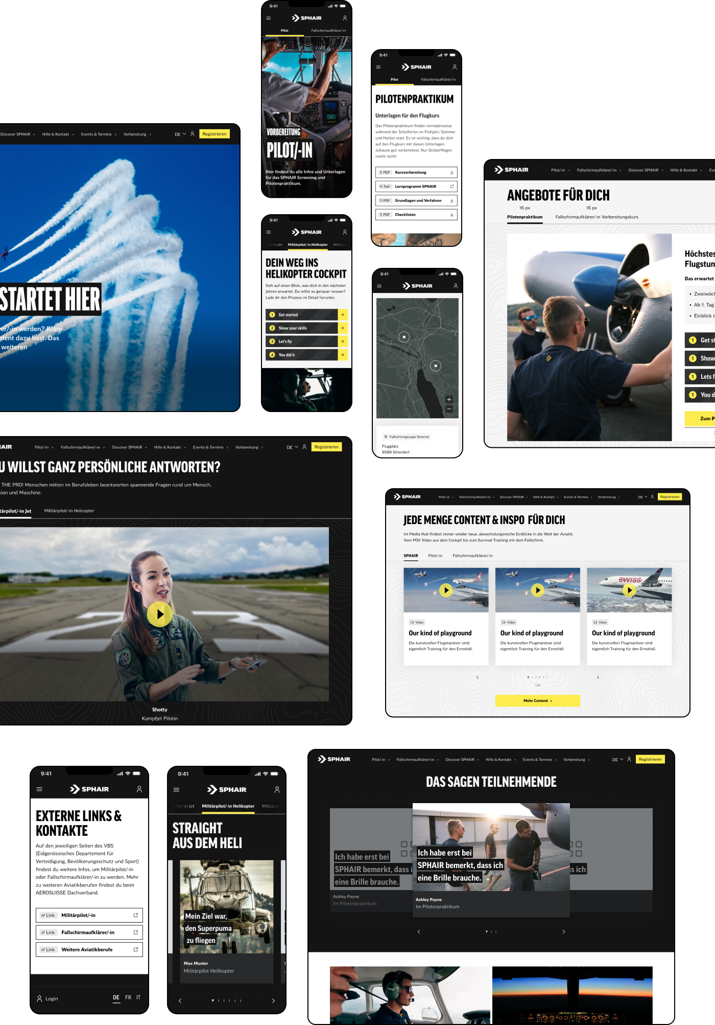
To achieve the most effective results, it was defined to propose a set of activities: designing a new brand identity, adapting the copy to a more informal tone of voice, redesigning the entire website with a mobile-first approach, refining information architecture and navigation, and creating a more engaging and interactive user experience.
As a result, we not only delivered a modern website with a clearly structured layout but also enhanced the overall user experience to address usability and intuitive navigation issues. Additionally, a cohesive design system supports brand identity, ensuring visual consistency.
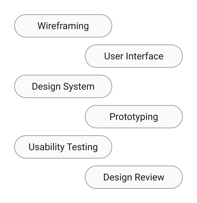
My core responsibility was to create responsive design for desktop, tablet and mobile. I created new components, maintained and further developed atomic design system. Apart from that, I was in charge of building a detailed prototype for client presentations and conducting usability testing. One of the active stages was the Design Review, where I actively contributed and collaborated with the external development team through Jira.


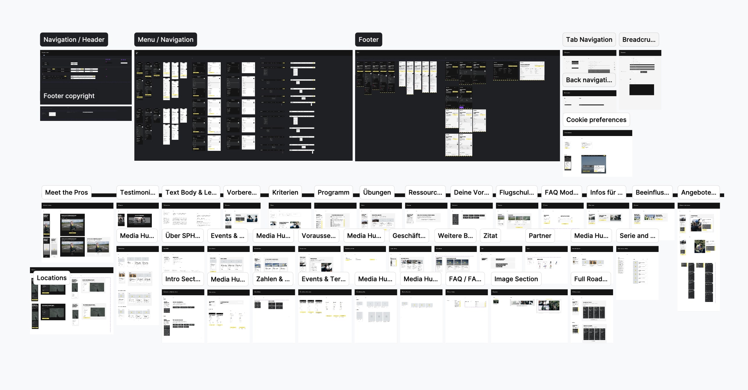
Throughout the iterative process I have created desktop experience using auto-layout, to build a reusable components and followed best practices.
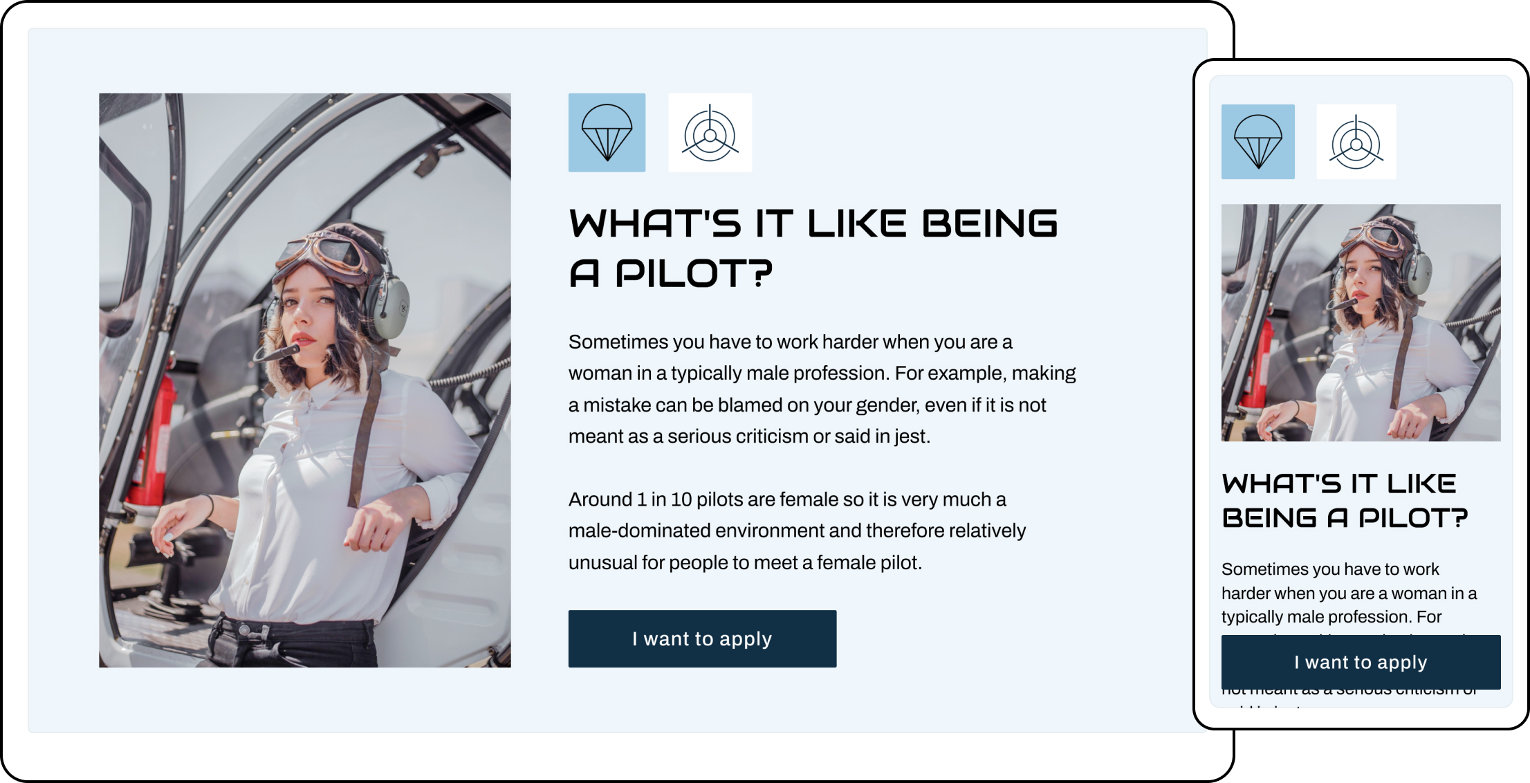
Crafting and scaling up atomic design system I built reusable components using auto-layout and variants. It's a thorough process where each UI Element requires accuracy in nesting tiniest elements and linking respective Color and Text Styles.
During the Usability session, I observed how the tester interacted with the mobile version of the website, gathered feedback and discovered the opportunity how we can improve the design, and learned more about the users preferences.

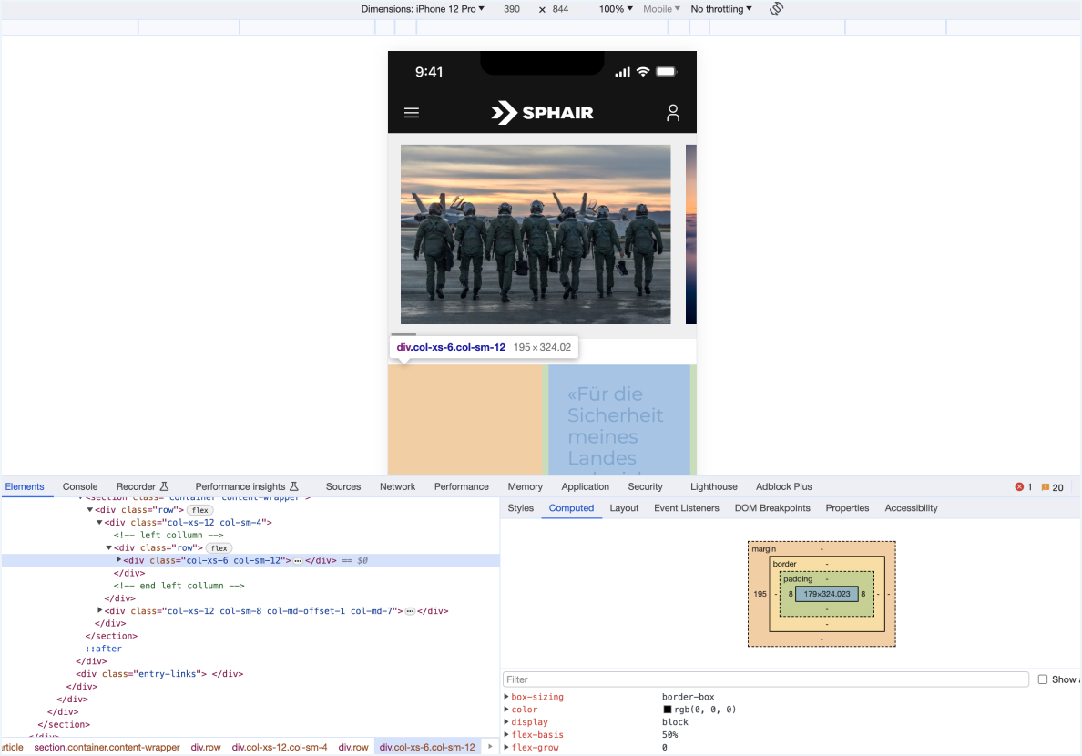
During the design implementation review stage, I ensured the proper development of all designs across various breakpoints and popular web browsers. To stay efficient and meet time constraints, we worked with a checklist to verify functionality, states, and micro-interactions of all components across different pages. We thoroughly documented all discovered issues and collaborated with development team in Jira.
