
Pathway Plan
Social productivity Appfor a local authority in London
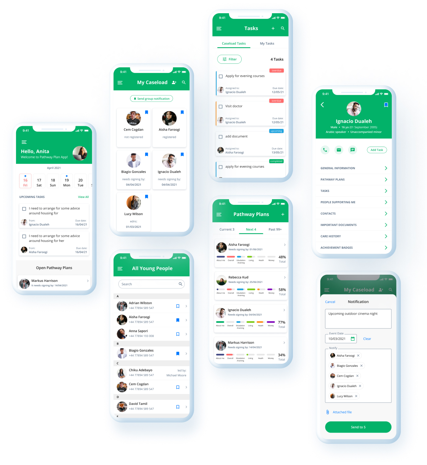
This App helps young people in care and social workers create and manage an official document that covers different areas of life such as finances, health, education, etc.
The problem we solved was transforming a boring paper collaboration into a digital experience with a simple and intuitive interface and building a relationship between young people in care and social workers.
Based on the research, we came up with the solution to create a progressive web app that allows users to participate in the program and get support and guidance from social workers.
As a result, the number of people who have started to participate in this government program highly increased because the process became more user-friendly and up-to-date.
I was responsible for:

On this project I have covered a whole design process and worked closely with a project manager and development team.
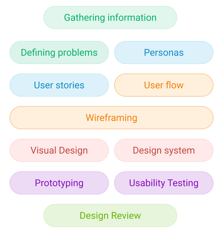
The information I have gathered gave me a deep understanding of the users' pain points and why they are not motivated to follow the pathway plan. Based on that I have created two types of Personas. Together with the project manager, we wrote the user stories that helped me to create a user flow and wireframes. Once the wireframe was agreed I continued with the hi-fi design and design system.
In the end, I've designed more than 200 high-fidelity mobile screens and created a clickable prototype for the usability testing.

This app has two types of users. I have created two flows for each type of user that has different functionality.

Ignacio is a Young adult currently under the care of Brent social services. He feels like he has too many responsibilities about his next step in adulthood.
He is looking for support with planning his future in way how he sees it. He is unsure what opportunities are open to him in education and training for building in future career and be independent.

Anita is a social worker in Brent care team. She is empathetic person and feel that Pathway Plan framework should take changes and transition to digital world and more social-opened for young persons.
She is passionate about supporting young people have better life, but she says that process should motivate and involve young people more in shaping the Pathway Plan together.
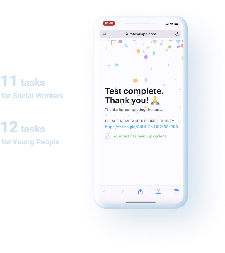
We have conducted remote usability testing. For that I have prepared 6 prototypes with more than 20 tasks. Most of the users completed tasks successfully. Results of the usability testing proved the design hypothesis and allowed us to start the development.
In the development stage, I was carefully reviewing the implementation of the design and supported the Development team with my suggestion in terms of usability and accessibility.
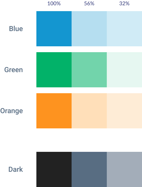
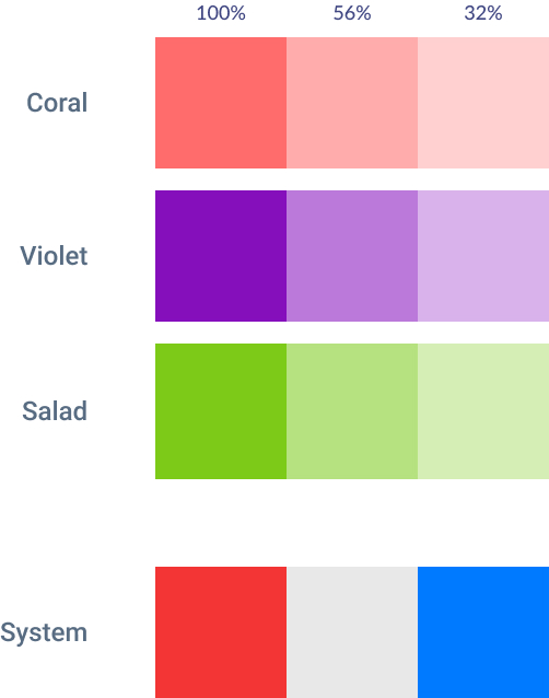
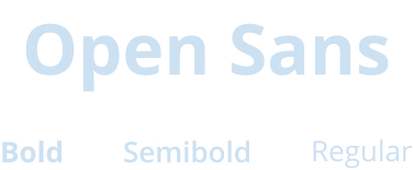
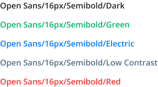
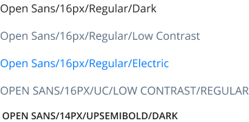
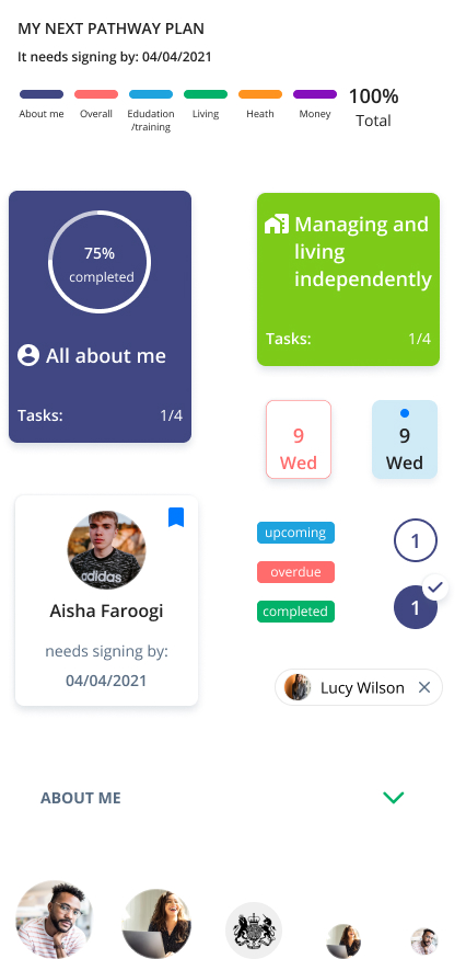
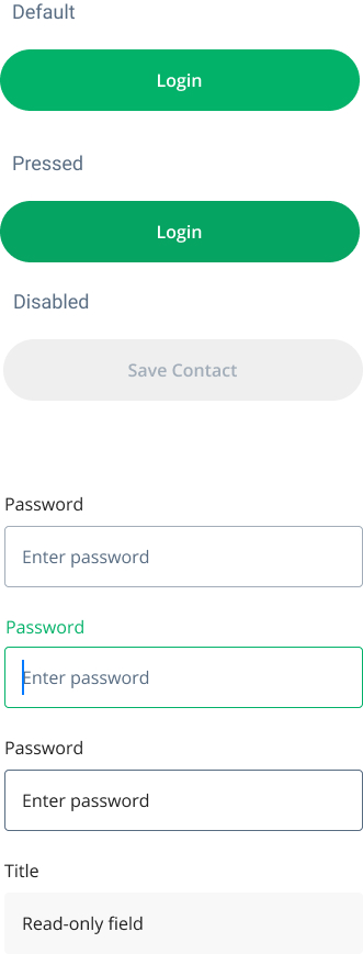
I’ve created a design system that consists of color and text styles, reusable components for easy maintenance.
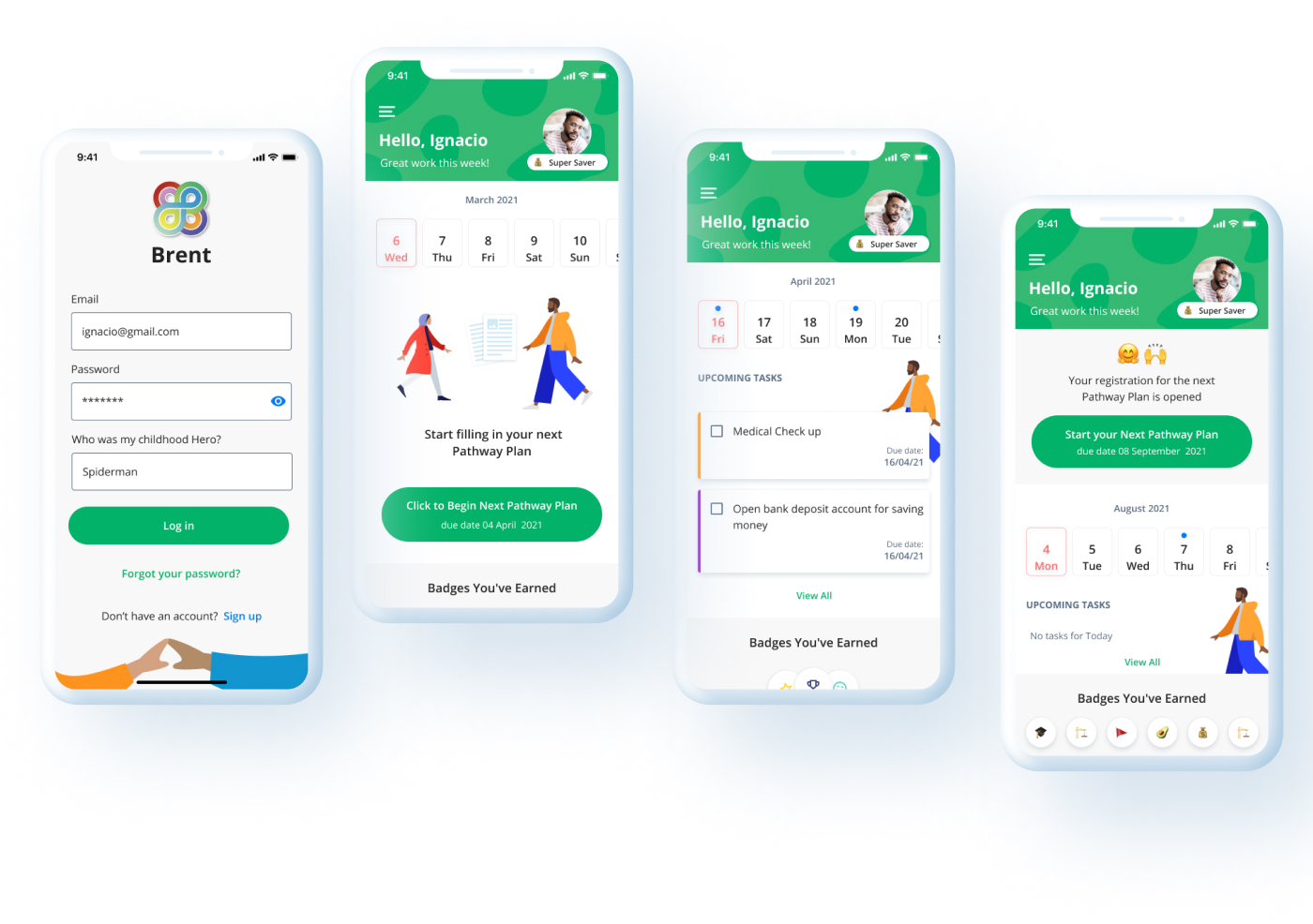
On the first screens, the Young Person can see the Calendar with tasks that need to be completed according to the Pathway Plan, section with badges and a big green CTA button to start the Pathway Plan.
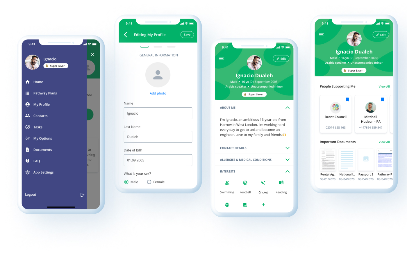
On the sidebar, Users can navigate to different pages of the web app and check important information in Profile
On the Pathway Plan screen, the User can see Current, Next and Past Pathway Plans.
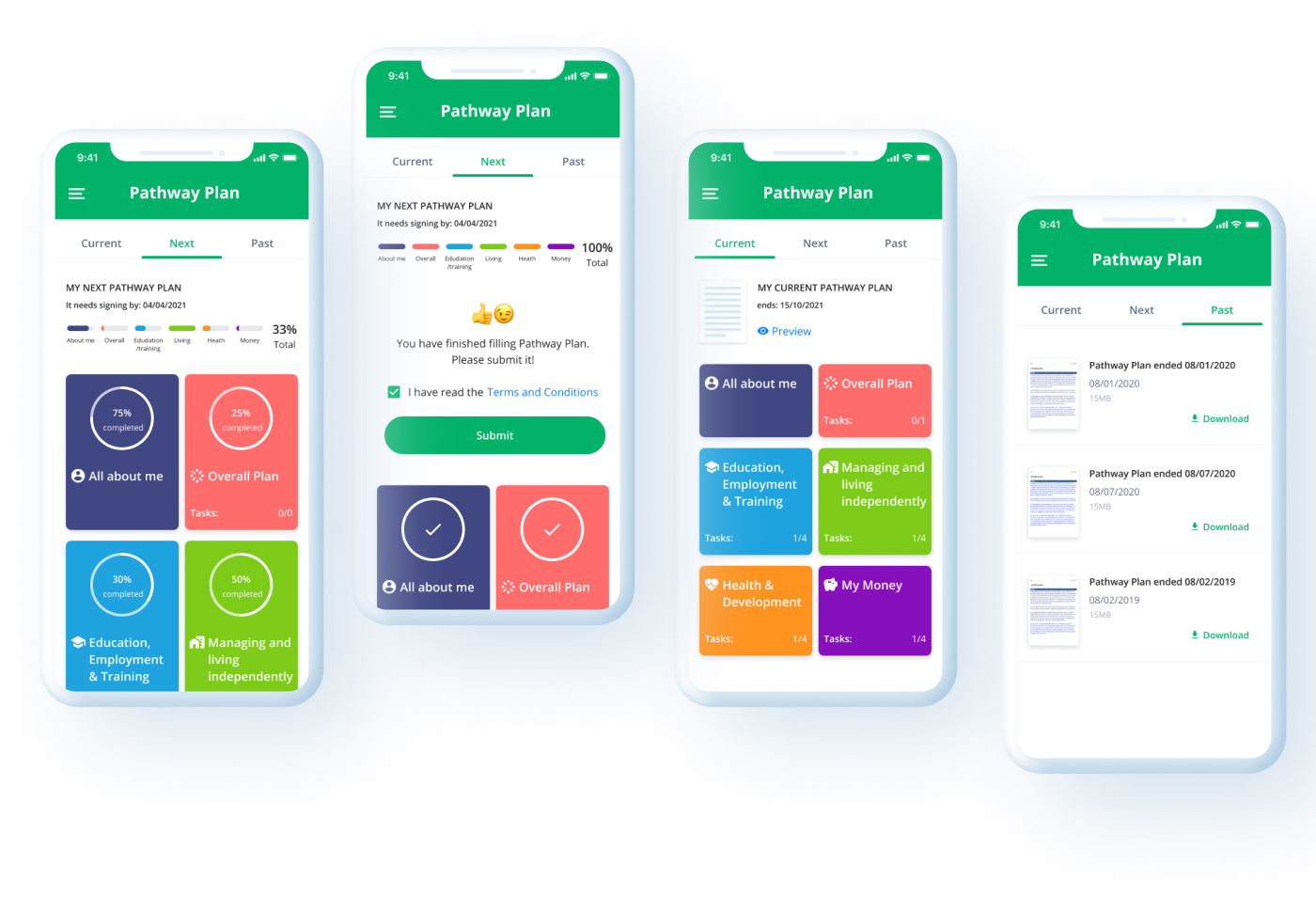
As you might know, official documents always contain a lot of fields that people have to fill in, so to make the navigation process easier for users, I’ve assigned specific colors to each section.
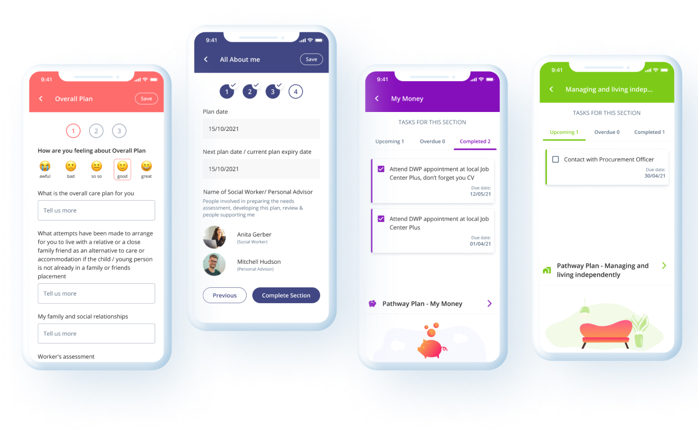
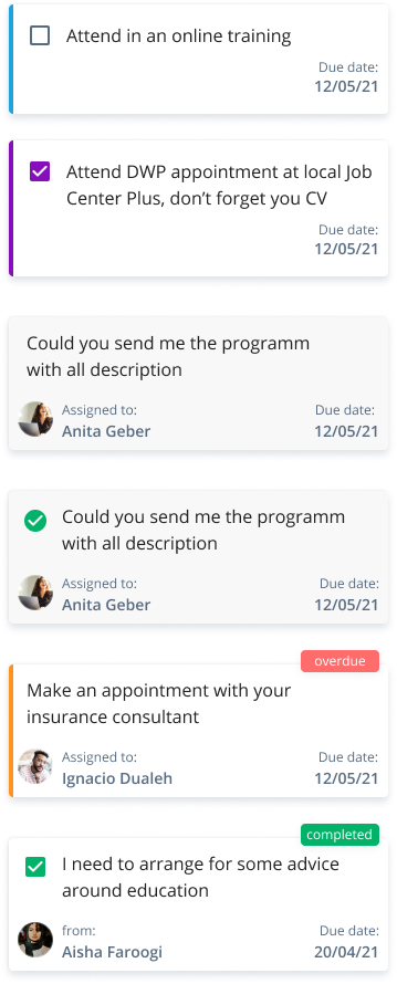
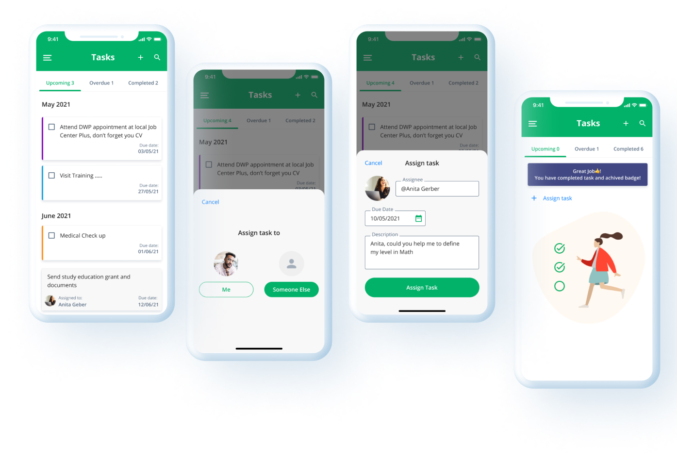
Users can clearly see tasks that are upcoming, overdue or completed by navigating the tabs. I decided to add color indication to task that gives an idea that a task belongs to a specific section of the Pathway Plan.
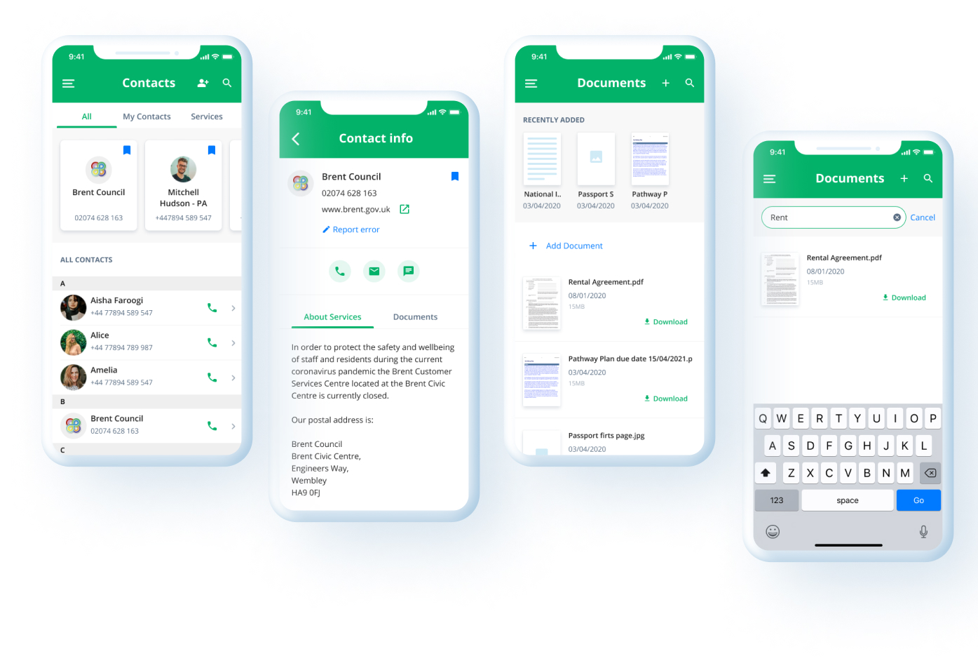
Users have access to important contacts. They can also create their own contacts. young people can upload and store different Documents.
On the other side social worker is able to:
This project is featured in The Best Bright Color App Designs by DesignRush